Computer Mockup V1: A Practical Creative Tool
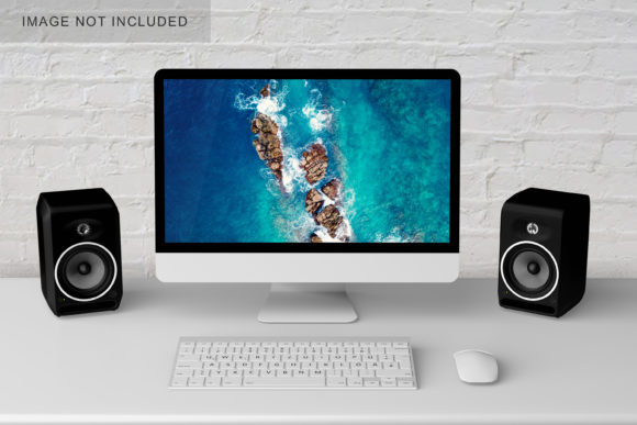
Computer Mockup V1 is a clean, editable digital template designed to showcase screens—whether it’s a website interface, mobile app flow, dashboard, or software prototype—on a realistic computer display. It’s not just a static image; it’s a flexible starting point that supports rapid iteration, client communication, and visual storytelling. What sets it apart isn’t flashiness—it’s clarity, adaptability, and intentionality. Built with designers and communicators in mind, it works where precision matters: pitch decks, portfolio case studies, social previews, documentation, and early-stage feedback loops.
Why It Fits Real Workflows
Unlike generic mockups cluttered with unnecessary shadows or exaggerated angles, Computer Mockup V1 uses subtle depth, neutral lighting, and a balanced aspect ratio (16:9) to keep attention on your content—not the frame. Its layered PSD or Figma file structure lets you swap screen content in seconds without distorting proportions or losing alignment. That means no more wrestling with perspective grids or manually adjusting reflections when updating a hero section or testing a new navigation layout.
It’s also resolution-ready: designed at 300 DPI for print handouts and optimized for web export at multiple scales. Whether you’re embedding a preview in a Notion brief, dropping a polished screenshot into a Shopify product page, or preparing assets for a Behance project post, the output stays crisp and context-appropriate.
For Designers & Developers
Use Computer Mockup V1 to visualize responsive behavior—place three variations side-by-side: desktop, tablet, and mobile—each inside its own appropriately scaled mockup. This makes breakpoints tangible for stakeholders who don’t read CSS. You can also layer annotations directly onto the mockup (e.g., “Hover state triggers dropdown” or “Error message appears below input”) without breaking visual hierarchy.
For Marketers & Small Business Owners
Turn feature updates into shareable visuals. Instead of writing “Our new analytics dashboard shows real-time conversion paths,” insert a simplified version of that dashboard into Computer Mockup V1, add a subtle callout arrow, and post it on LinkedIn or email newsletters. The mockup adds credibility and reduces cognitive load—people grasp function faster when it’s shown in context.
For Educators & Trainers
Create step-by-step tutorials with consistency. In a course on Figma basics, use Computer Mockup V1 to frame each key interface change—“Here’s where you find Auto Layout,” “This is how constraints behave on resize”—so learners always know what part of the screen to focus on. Reuse the same mockup file across lessons to build visual continuity and reduce onboarding friction.
For Bloggers & Content Creators
Illustrate tool comparisons cleanly. Rather than stacking screenshots haphazardly, place competing tools’ dashboards inside identical Computer Mockup V1 frames. Align them horizontally, label each clearly, and highlight one distinguishing UI pattern per frame (e.g., placement of search bar, default sidebar state). Readers scan faster and retain more when differences are visually anchored—not buried in paragraphs.
Adapting Style Without Losing Clarity
You don’t need to stick to the default gray bezel. Swap colors thoughtfully: a soft charcoal for enterprise B2B content, muted sage for sustainability-focused SaaS, or warm off-white for creative portfolios. Just ensure contrast between screen content and bezel remains high enough for readability—even in thumbnail size.
Lighting matters too. The base file includes subtle ambient highlights along the top edge and gentle screen reflection. If your content has light text on dark backgrounds (like a code editor), reduce reflection opacity slightly so text stays legible. For dark-themed presentations, consider lowering overall shadow intensity to avoid visual heaviness.
Consistency builds trust. If you’re building a multi-page case study, use the same mockup orientation (landscape only), same font size for labels (if adding them), and same export settings (e.g., PNG-24 with transparent background for web, PDF/X-4 for print). Small choices like these signal professionalism—not perfectionism.
Practical Tips for Stronger Results
- Keep screen content focused: Crop out unnecessary UI chrome (e.g., browser tabs, OS taskbars) unless they’re central to your point. One clear message per mockup works best.
- Use real content, not lorem ipsum: Even placeholder copy should reflect actual tone and hierarchy—headline size, paragraph length, button labeling. It reveals usability issues early.
- Test at scale: Zoom out to 25% in your design tool. Can you still tell what’s being shown? If not, simplify layout or increase key element contrast.
- Export smartly: For web, save as WebP with lossless compression for sharpness and speed. For client PDFs, embed fonts and flatten layers to prevent editing surprises.
- Attribute meaningfully: If sharing publicly, credit the mockup source if required—but more importantly, explain *why* this view matters. “This shows how users complete checkout in under 3 clicks” adds value far beyond the visual.
Going Beyond the Screen
Computer Mockup V1 isn’t limited to flat displays. With basic layer manipulation, you can simulate subtle interactivity: duplicate the screen layer, apply a slight offset and reduced opacity to suggest a modal overlay; add a soft glow behind a highlighted button to imply focus; or place a semi-transparent cursor graphic near an input field to indicate next action. These aren’t animations—but they guide the eye with purpose.
You can also combine it with other assets intentionally. Pair it with a short video loop (exported from Loom or similar) embedded in the screen area to demonstrate micro-interactions. Or place the mockup beside a concise bulleted list of benefits—“Faster onboarding,” “Fewer support tickets,” “Higher task completion”—to bridge visual and verbal reasoning.
And remember: it’s a tool, not a requirement. If a wireframe sketch better serves your goal—say, exploring layout options with a developer—skip the mockup entirely. Computer Mockup V1 earns its place when realism strengthens understanding, not when it slows you down.
Getting Started Thoughtfully
Download Computer Mockup V1, open it in your preferred editor, and try one small thing today: replace the placeholder screen with a live screenshot from your current project. Adjust brightness just enough to match your environment. Export it. Then ask yourself: does this make the idea easier to grasp? Does it remove ambiguity? If yes—you’ve already unlocked its core benefit.
No special skills needed. No subscription. Just clarity, control, and a little space to think visually—without distraction.